CEO
CEO
ui redesign
ui redesign
ui redesign
brand design
brand design
brand design
website design
website design
website design
3 Weeks | Freelance
3 Weeks | Freelance
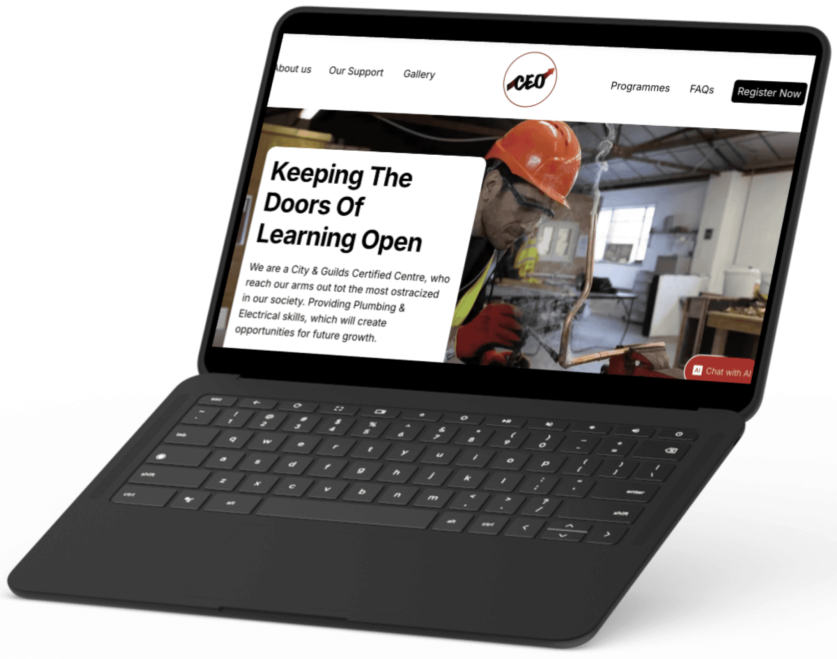
CEO is a community interest company (CIC) which looks to aid youth into the construction industry through training and up skilling. This Redesign focused on the website UI to create a more homogenous user experience. Removing clutter and providing consistency throughout. While creating a consistent branding throughout.
CEO is a community interest company (CIC) which looks to aid youth into the construction industry through training and up skilling. This Redesign focused on the website UI to create a more homogenous user experience. Removing clutter and providing consistency throughout. While creating a consistent branding throughout.
brief
brief
Redesign company website in order to create a more succinct customer user experience.
Redesign company website in order to create a more succinct customer user experience.
objective
objective
Redesign the user flow and refresh the user interface in order to incorporate the brand identity throughout.
Redesign the user flow and refresh the user interface in order to incorporate the brand identity throughout.
core problem
core problem
Current information architecture is over saturated and lacks clarity. Navigation lacks continuity and flow.
Current information architecture is over saturated and lacks clarity. Navigation lacks continuity and flow.
current website
current website
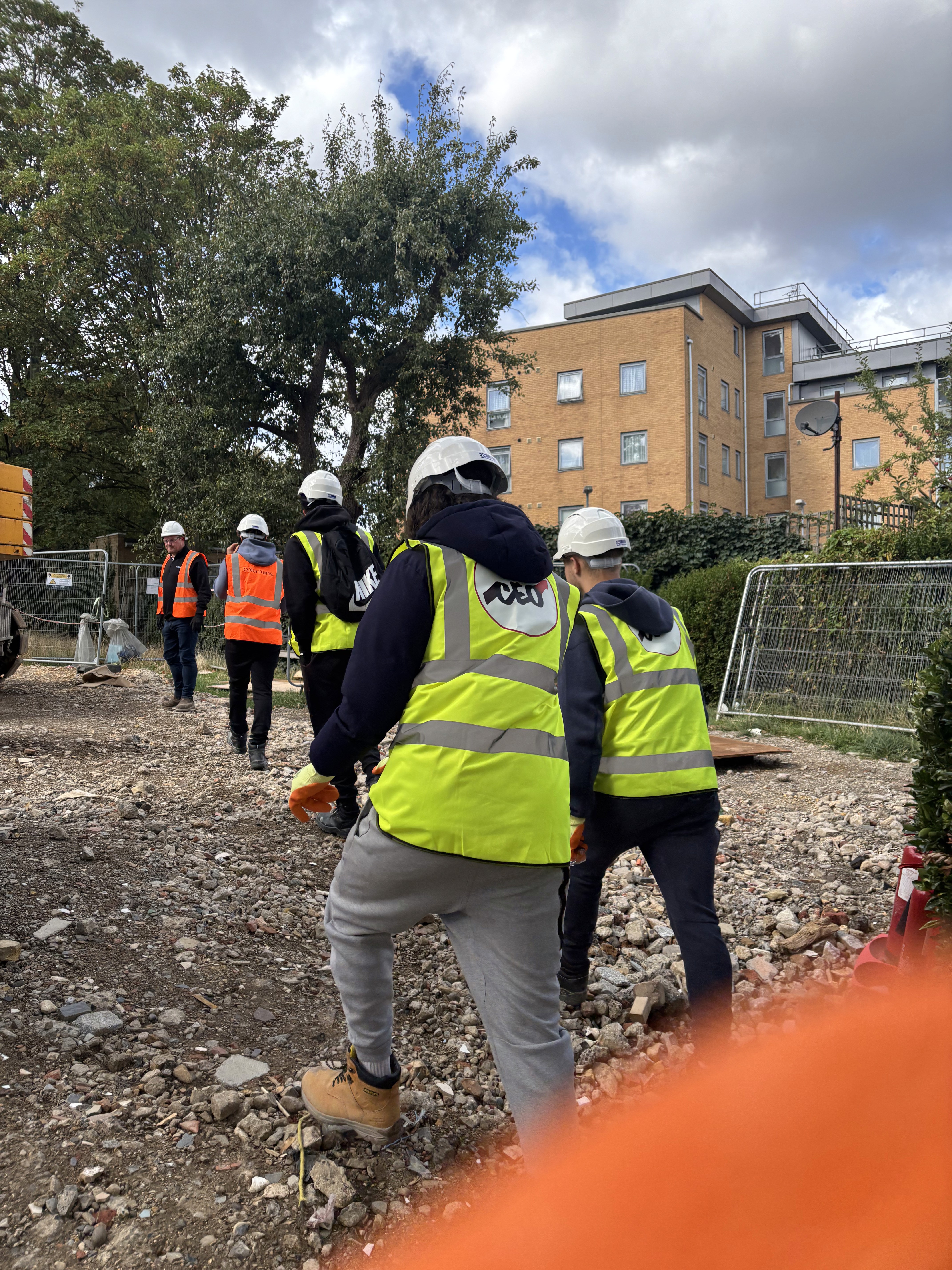
The current website was built with the growth of the business and in turn information pages and programmes were added without adjusting the previous experiences. In turn there is a lack of consistency in both the UI and there is a wealth of mixed information across pages.
The current website was built with the growth of the business and in turn information pages and programmes were added without adjusting the previous experiences. In turn there is a lack of consistency in both the UI and there is a wealth of mixed information across pages.
story
story
Landing page lacked narrative which explains and exhibits the good work which the company completes. The narrative for a non-profit is essential; it is what visitors need to buy into to and support their work.
Landing page lacked narrative which explains and exhibits the good work which the company completes. The narrative for a non-profit is essential; it is what visitors need to buy into to and support their work.
brand identity
brand identity
Lack of consistent branding throughout the site. The site has multiple images and colours which cause clashes with legibility issues.
Lack of consistent branding throughout the site. The site has multiple images and colours which cause clashes with legibility issues.
user flow
user flow
Finding information on particular courses is extremely hard. Completing a full task often leads to multiple pages which are not relevant to what the users desired outcome is.
Finding information on particular courses is extremely hard. Completing a full task often leads to multiple pages which are not relevant to what the users desired outcome is.

user testing
user testing
“The website looks a bit overwhelming, I feel like I’m constantly being sold something”
“The website looks a bit overwhelming, I feel like I’m constantly being sold something”
user testing
user testing
I undertook user testing to understand the main points of friction within the current design. There were 8 participants who were asked to complete a task, followed by questions to understand the reasons why they took particular routes
I undertook user testing to understand the main points of friction within the current design. There were 8 participants who were asked to complete a task, followed by questions to understand the reasons why they took particular routes
observations
observations
Key observations from the task included:
Having to go through multiple pages before reaching intended page.
Visually consufed when gallery page was shown when looking for booking
Questioned the multiple use of fonts across multiple pages.
Key observations from the task included:
Having to go through multiple pages before reaching intended page.
Visually consufed when gallery page was shown when looking for booking
Questioned the multiple use of fonts across multiple pages.
insights
insights
From these observations 3 key insights formed providing the key areas to increase the current flow.
Over complicated user flow
Text descriptions lack clarity and do not instil confidence within the visitor
Branding and font choices are overbearing , lacking uniformity throughout the site
From these observations 3 key insights formed providing the key areas to increase the current flow.
Over complicated user flow
Text descriptions lack clarity and do not instil confidence within the visitor
Branding and font choices are overbearing , lacking uniformity throughout the site
Course Infromation
Course Infromation
Booking Courses
Booking Courses
About Us
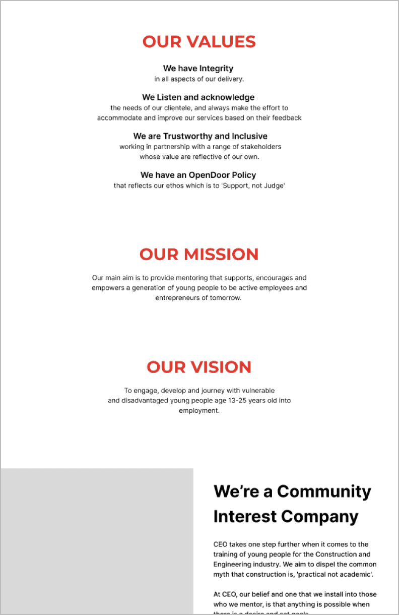
Courses
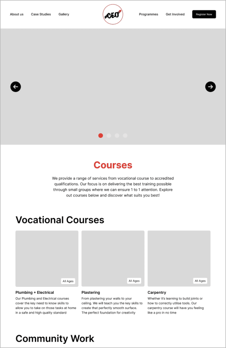
About Us
About Us
Courses
Courses
Header 1
Header 1
Montserrat Bold 60
Montserrat Bold 60
Montserrat Bold 60
abcdefghijklmnop
abcdefghijklmnop
abcdefghijklmnop
Header 2
Header 2
Inter Semi-Bold 60
Inter Semi-Bold 60
Inter Semi-Bold 60
abcdefghijklmnop
abcdefghijklmnop
abcdefghijklmnop
Small Headers
Small Headers
Inter Medium 30
Inter Medium 30
abcdefghijklmnop
abcdefghijklmnop
Body Text
Body Text
Inter regular 24
Inter regular 24
abcdefghijklmnop
abcdefghijklmnop

#5D0613
#5D0613
#7E1416
#7E1416
#B32025
#B32025
#E22229
#E22229
#FFFFFF
#000000
landing page
before
Before
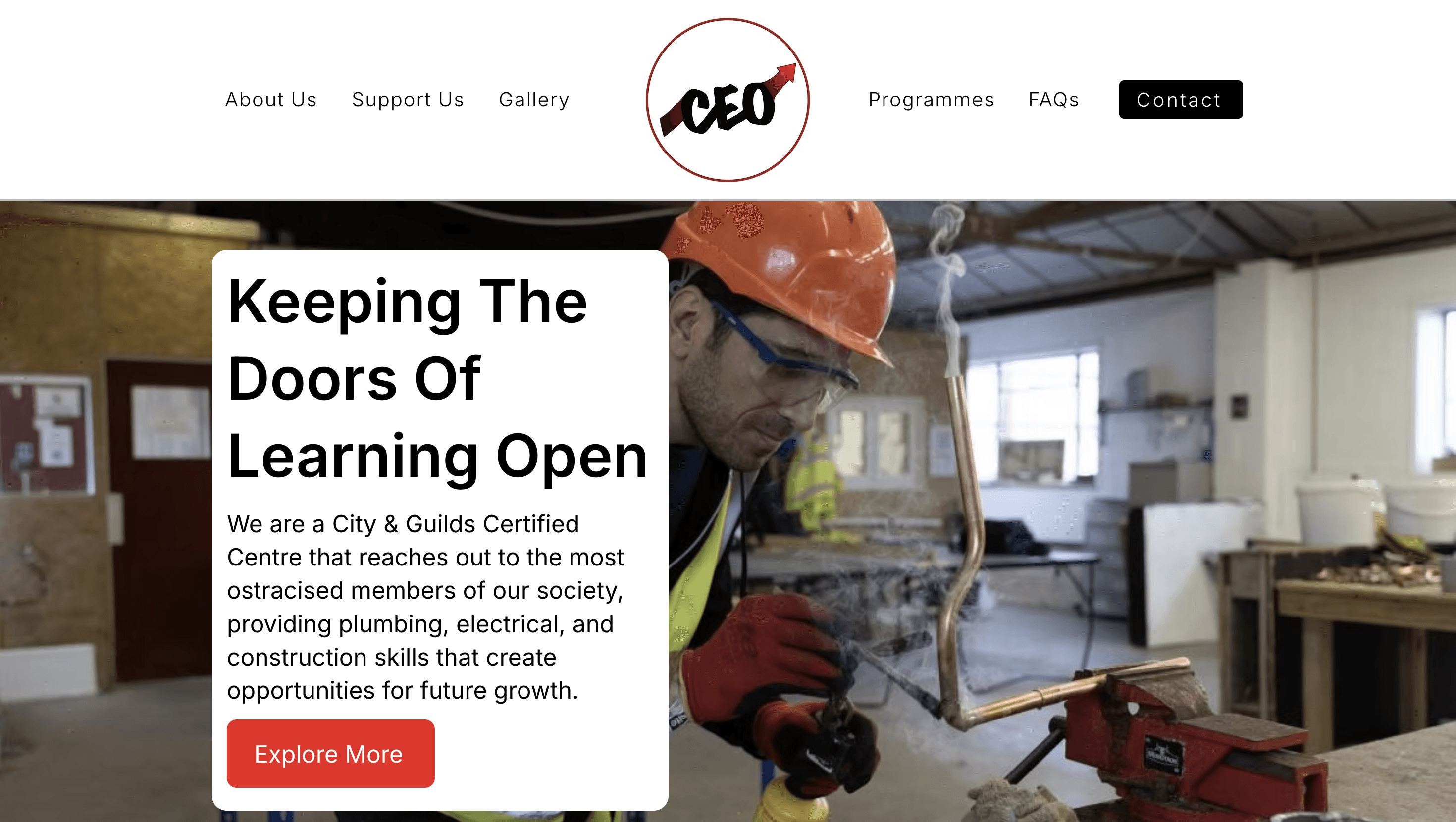
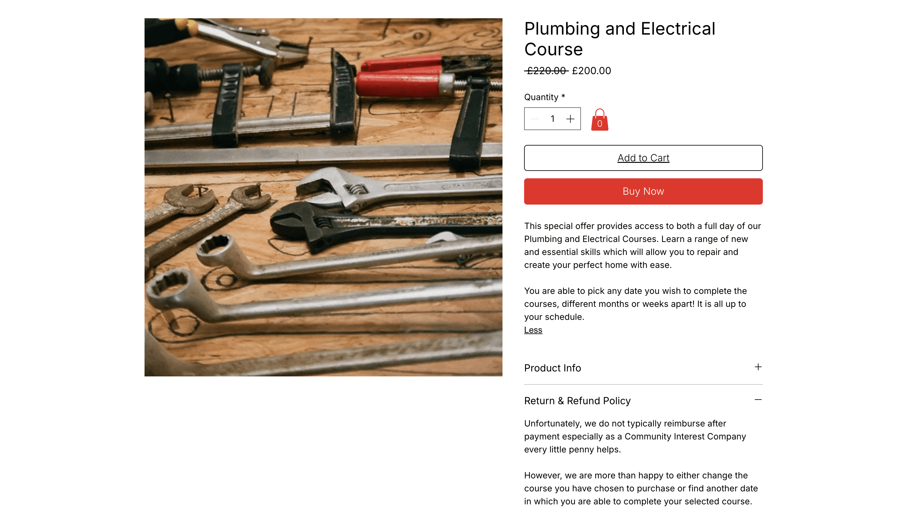
Initial page promoted purchases without explaining the impact their work completed. While the navigation bar was oversaturated with options making it harder to navigate.
Initial page promoted purchases without explaining the impact their work completed. While the navigation bar was oversaturated with options making it harder to navigate.
after
After
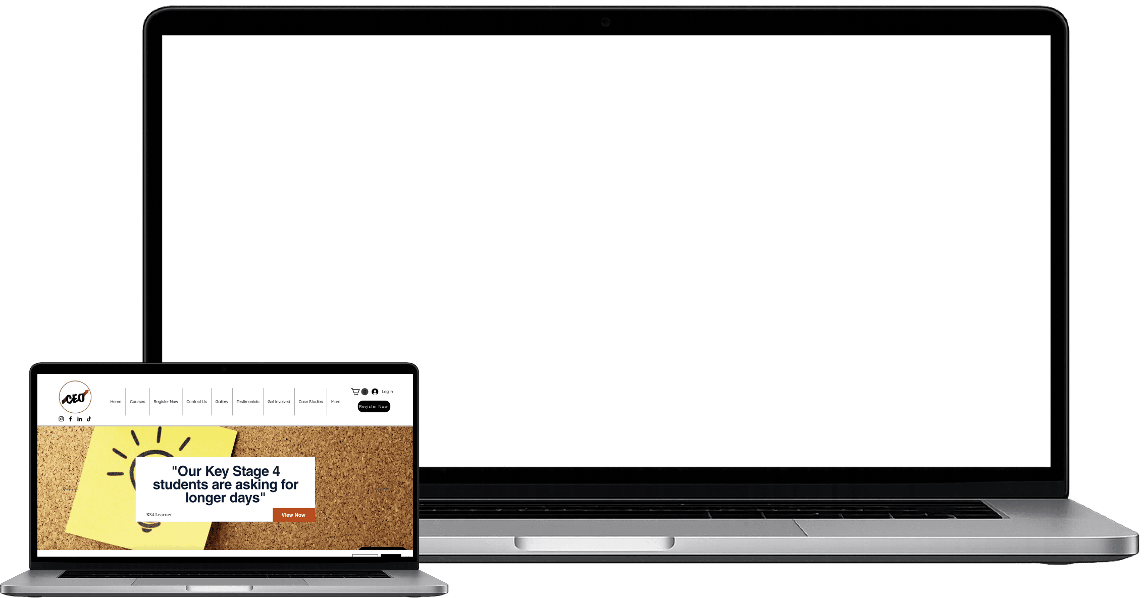
Utilising key terms to guide users to points of interest creates clarity and ease of navigation.
Forming a narrative from issue to the impact the company has creates a key vision of what the visitor is buying into.
Utilising key terms to guide users to points of interest creates clarity and ease of navigation.
Forming a narrative from issue to the impact the company has creates a key vision of what the visitor is buying into.
Utilising key terms to guide users to points of interest creates clarity and ease of navigation.
Forming a narrative from issue to the impact the company has creates a key vision of what the visitor is buying into.
getting involved
before
before
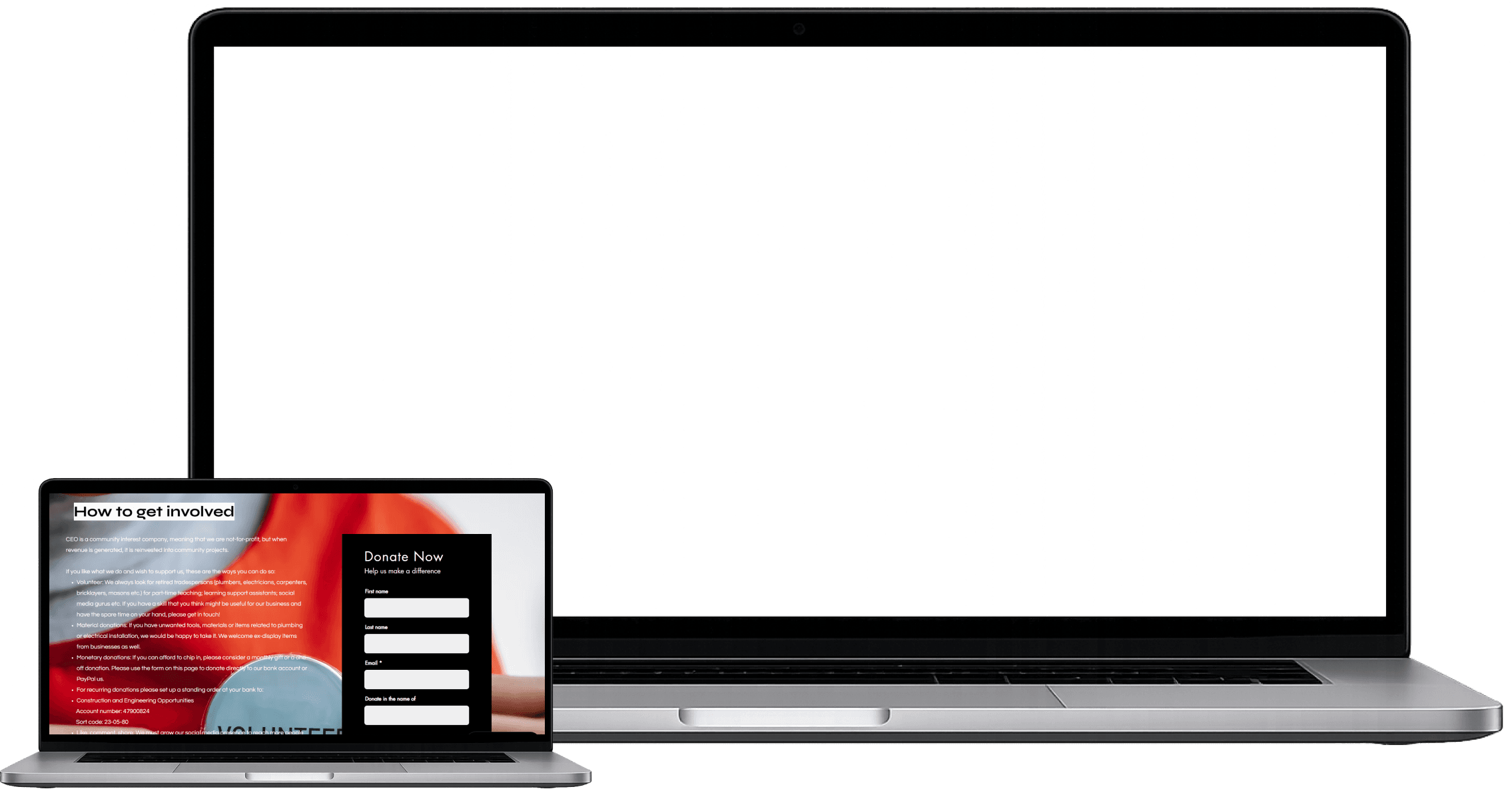
Heavy in text which lacks contrast, making it hard for users to understand how to get involved with supporting the company. There is also no obvious way of donating other than through direct bank transfer.
Heavy in text which lacks contrast, making it hard for users to understand how to get involved with supporting the company. There is also no obvious way of donating other than through direct bank transfer.
after
after
Bold titles make it unmistakable the ways in which you can get involved. While donation section provides immediate options to make an impact with option of frequency.
Bold titles make it unmistakable the ways in which you can get involved. While donation section provides immediate options to make an impact with option of frequency.
programmes
before
Before
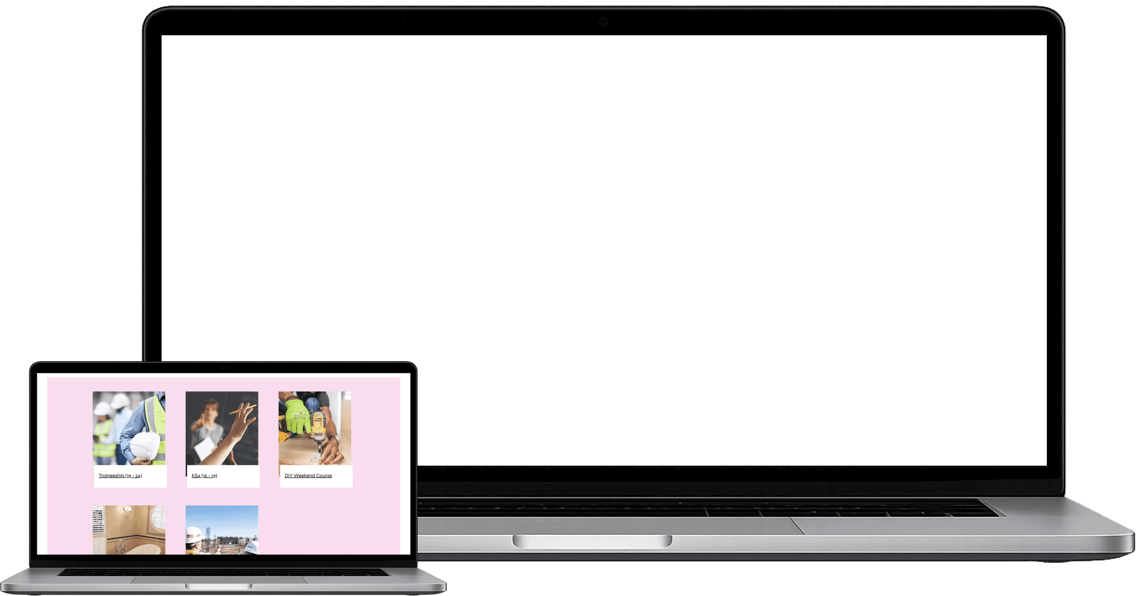
Lacks information on each course is about. While colours are within brand guidelines it doesn’t present the options in the best manner.
Lacks information on each course is about. While colours are within brand guidelines it doesn’t present the options in the best manner.
after
After
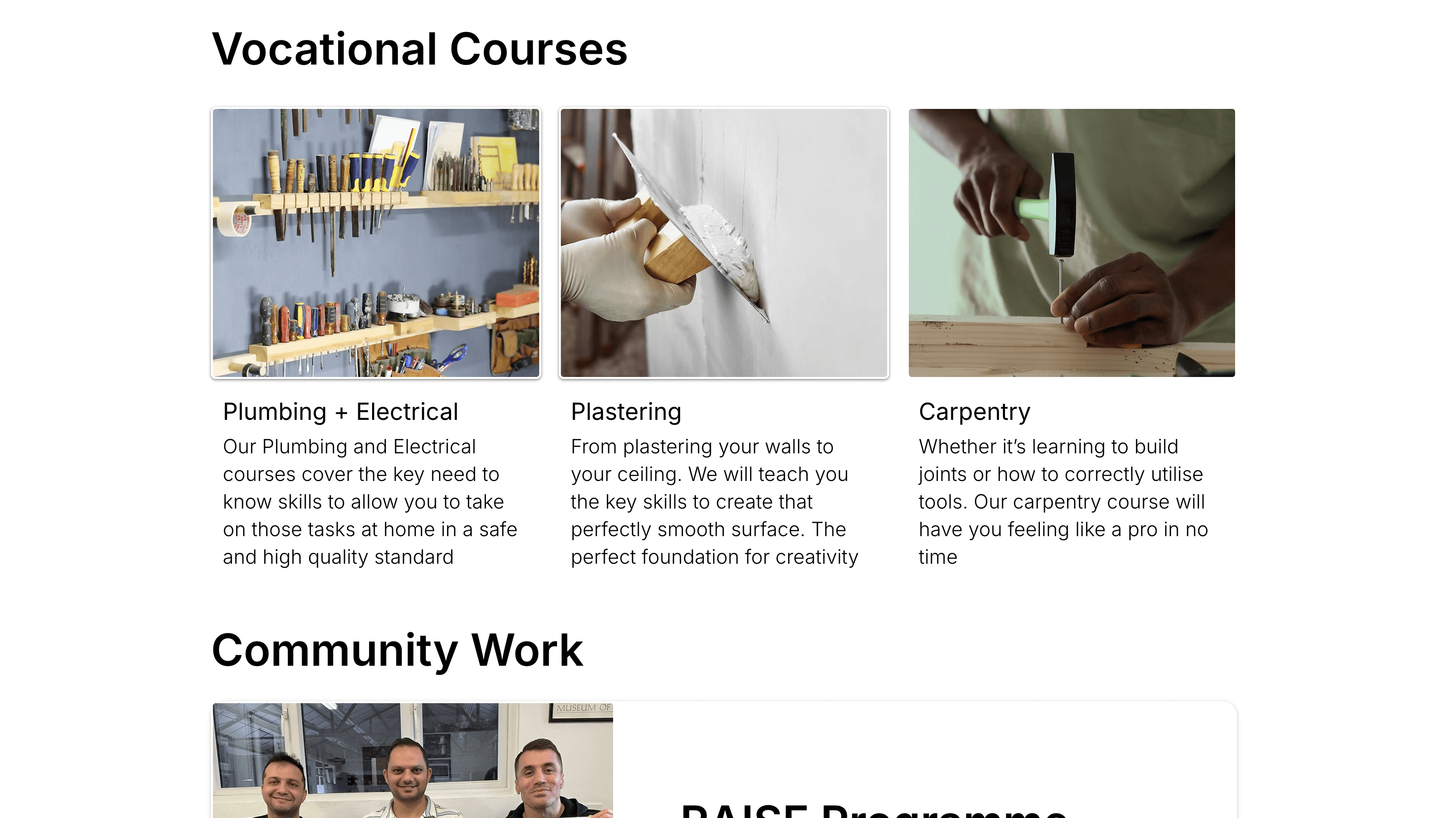
Titles provide information on what type of people each course serves. While short sharp description provides visibility on what users can expect.
Titles provide information on what type of people each course serves. While short sharp description provides visibility on what users can expect.
Vocational Courses
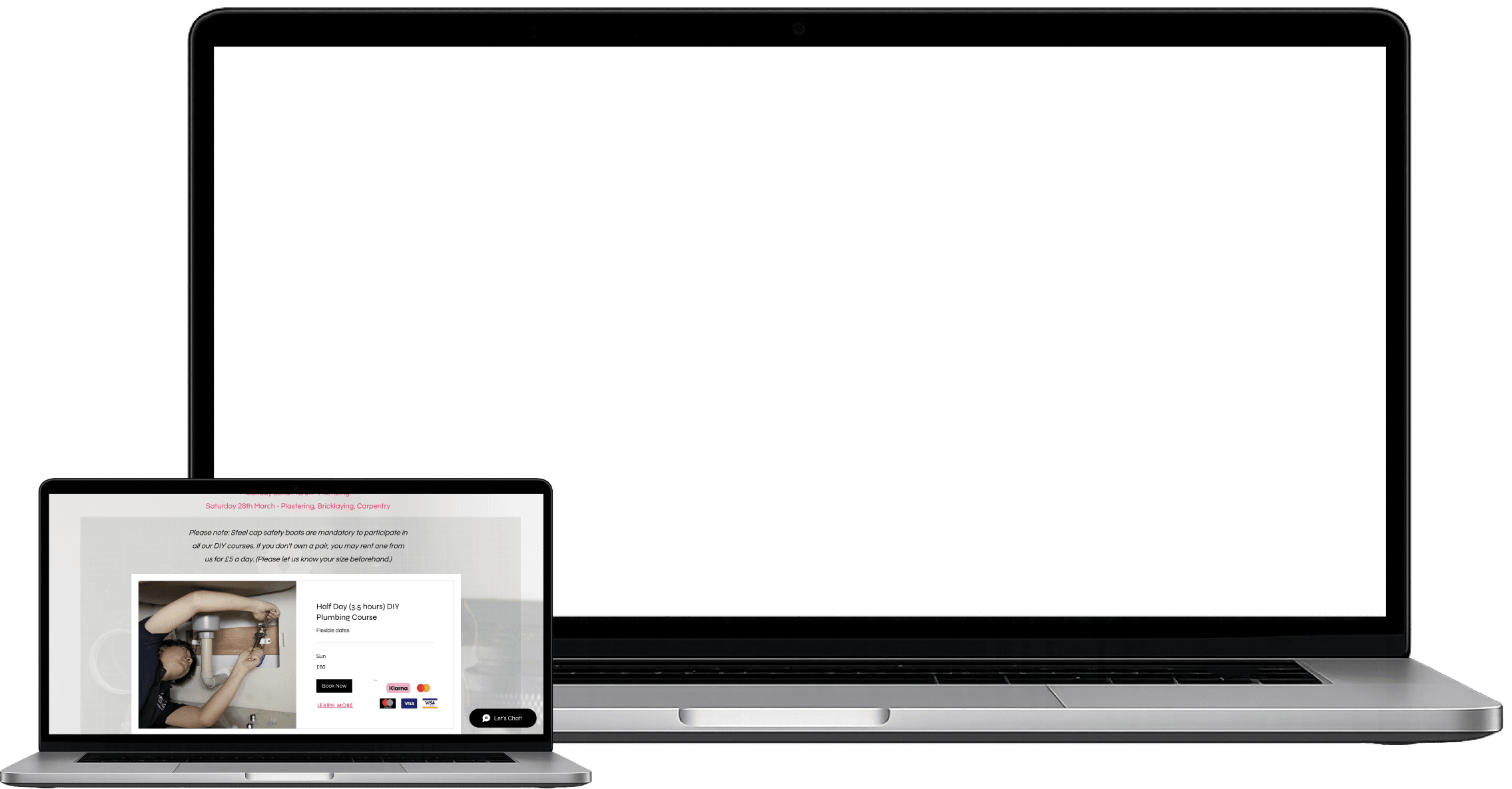
Before
Before
Learn more button adds an additional step to understand what the course entails, while background and font creates an overload of information.
Learn more button adds an additional step to understand what the course entails, while background and font creates an overload of information.
After
After
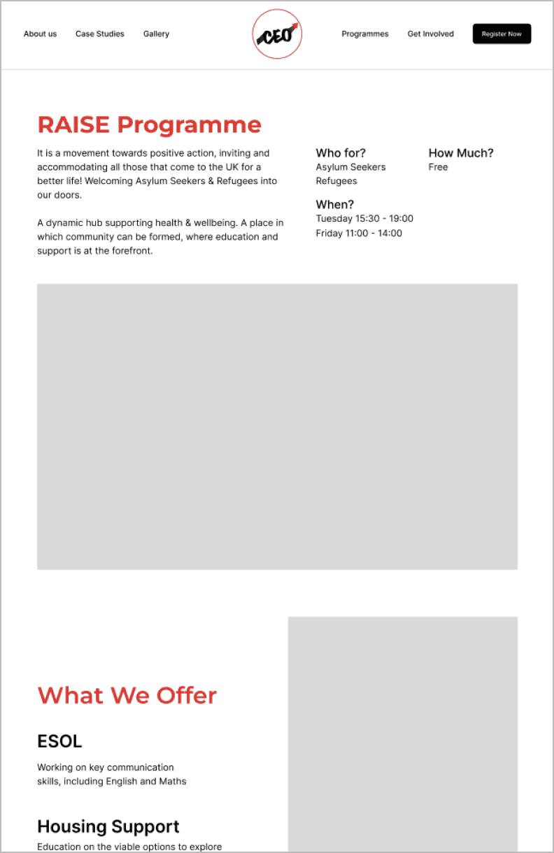
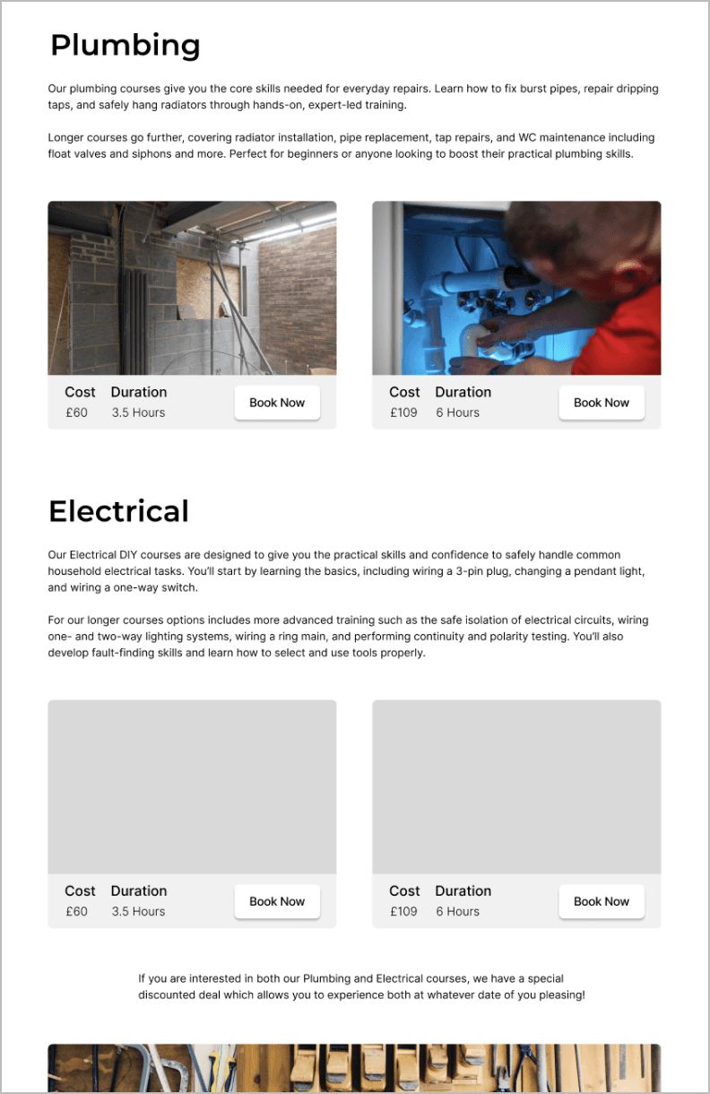
First view of page provides key information on what the user should expect, who it is for and the price. The courses are now bunched and can easily see the ways in which to book.
First view of page provides key information on what the user should expect, who it is for and the price. The courses are now bunched and can easily see the ways in which to book.
client feedback
client feedback
“The use of fonts is a great, the information is a lot clearer especially with the plainer background”
“I like how the colours are very consistent and clear. They really go well with our brand colours and the energy we want to present”
“The front page story line is really good, it really explains what we do well”
“The use of fonts is a great, the information is a lot clearer especially with the plainer background”
“I like how the colours are very consistent and clear. They really go well with our brand colours and the energy we want to present”
“The front page story line is really good, it really explains what we do well”
want to see more?
want to see more?
